I think this is by far my favorite project so far. The Easy die-cutting Techniques course at Altenew was taught by Yana Smakula. I love seeing all of the inspiration projects listed and especially when there is an added file for even more creativity to soak in.
I tried to link the instagram post but the image wouldn't cooperate with the size of the window...so here we are.
I recently got the Zero waste cover dies that are available at Altenew and the flowers are so much fun to work with. I couldn't wait to get started on them.
So I chose the die to be the star of the card so to say in two of them. I cut a total of 6 panels and made 3 cards. The fourth is still sitting on my desk but it's almost complete.
Card 1
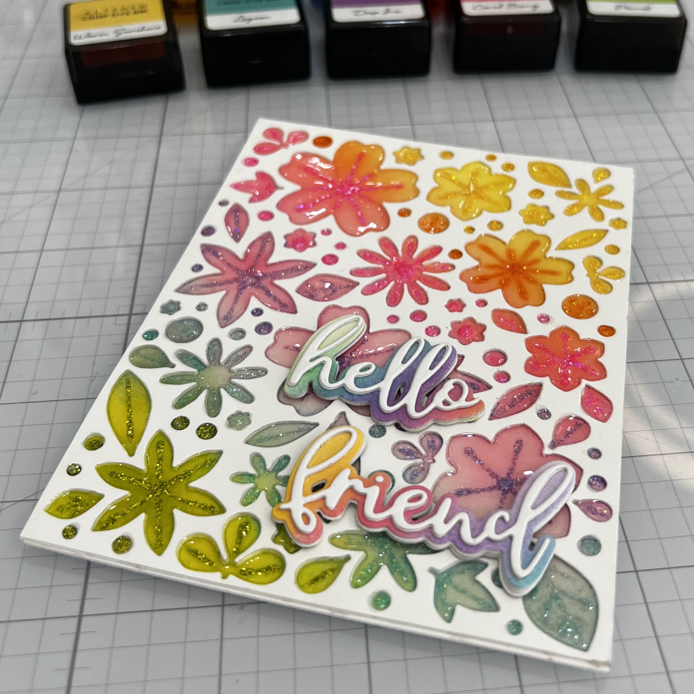
The first card was cut from 110lb.cardstock along with a backing of double-sided adhesive and I ink-blended the entire die with the mini ink blending tools. Then popped all of the flowers out and adhered them to a white die cut, glueing 3 together to give the flowers a sinked in effect. I used Stickles of each matching color to trace over the embossed part of each flower, leaves and dots. I let it dry overnight and then went to work on filling each image with Diamond Glaze. This took up a lot of time because I had to use a straight pin to spread the glaze just enough so it didn't overflow and try to keep it from filling to much with the stickles already there. Then had to wait for it to dry completely. After it dried, I realized that because the glaze is basically liquid, it faded the ink colors quite a bit. Not a terrible happenstance, but a noted tip for next time. Water based inks don't like glaze...I chose not to add anything to the sentiment that I cut from the xoxo and more dies. I added some ink to match the panel and cut the smaller sentiment in white. Adhered them and called it done. 😉
Card 2
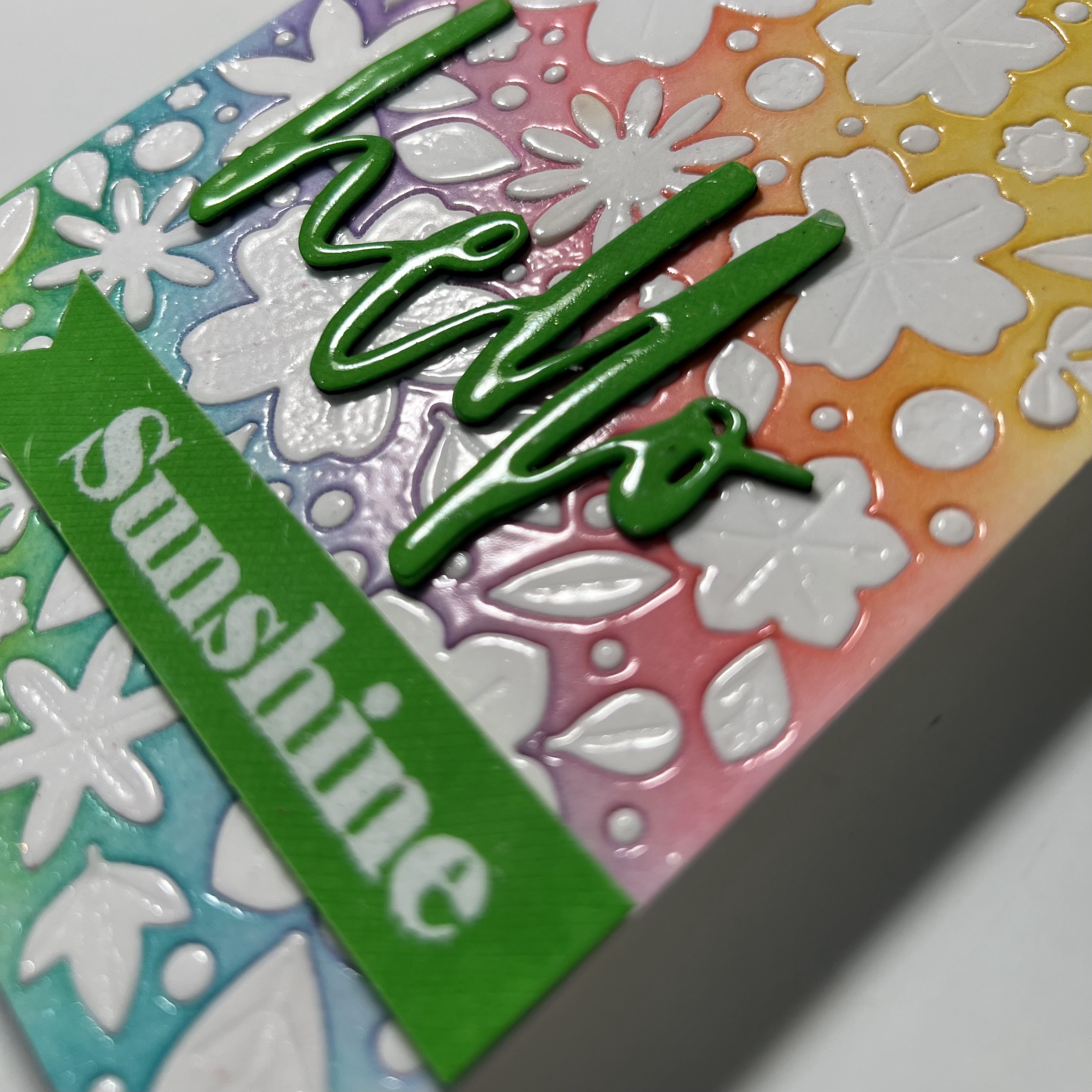
Then next card was what I did with the cut out part of the die. I added the white flowers, leaves and dots into it and versa-marked the entire panel. I heat set it with clear embossing powder and proceeded to repeat the process three more times to build up shine and dimension. I cut the word hello from the water brush hello die in a bright almost neon cardstock and stacked it 4 times with white cardstock for more dimension as well. I then stamped the sentiment Sunshine from the Paint-a-Flower Modern Pink Dianthus stamp set in versa-mark and heat embossed it with white embossing powder. The last step was to cover the sentiment with versa-mark and clear embossing powder for the same affect, repeating that step several times as well.
Card 3
The last card, was made with the left over die cuts from the first card. I ink blended them with the Trail Blazing Fresh Dye Inks. I used the Woodland Escape and the Frosted Foliage colors. I used the Spring Blossoms embossing folder for the panel and placed some of the dots and leaves in areas that seem to match the shapes. I added some craft foam to the back and adhered it to a card base. I cut the word hello from the xoxo and more dies set, inked the shadow and and added the sentiment to the horizontal card.
If you're still with me through all of this, a huge THANK YOU!

Card 2

Card 3


Comments